
Remastering “Core Differences”

AI is abuzz in the world of art, film, and tech, the various disciplines around which I find myself continuously revolving. Questions of ethics and threats to jobs are abundant across social media and journalistic outlets. So I’d rather talk about my much tamer and IMO quite interesting use of it in recent months—restoring my own old(ish) video projects.
Some of the earlier examples of what AI was capable of was in the world of up-resing photos. These examples weren’t merely clever filtering on scaling images up. They could actually identify features and create new detail. This very quickly started being applied to video as well.
Over time I would fiddle with various tools that would pop up, try a few things, be unimpressed, and move on. But eventually a demo of Topaz Video AI landed on my Mac… and the flood gates of possibilities opened in my mind.
Keeping Myself Swamped…

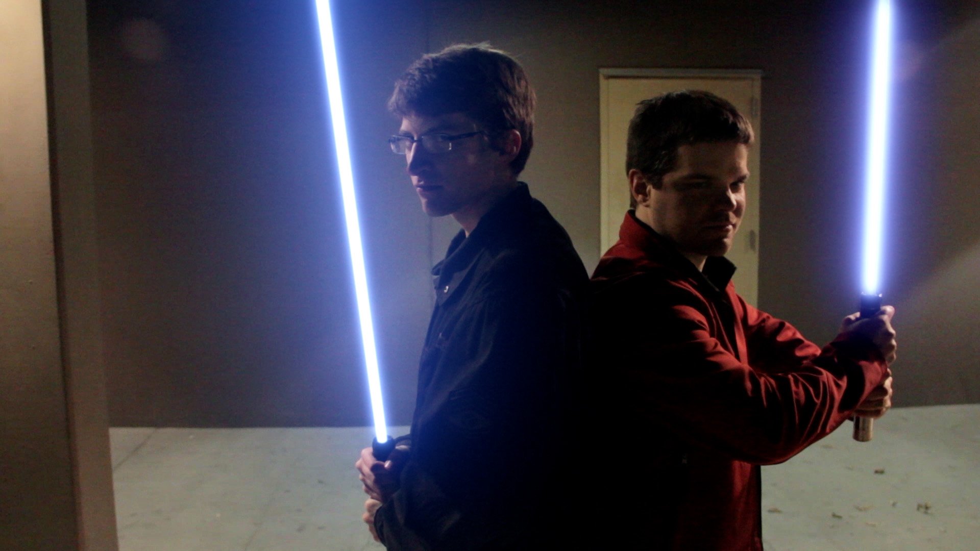
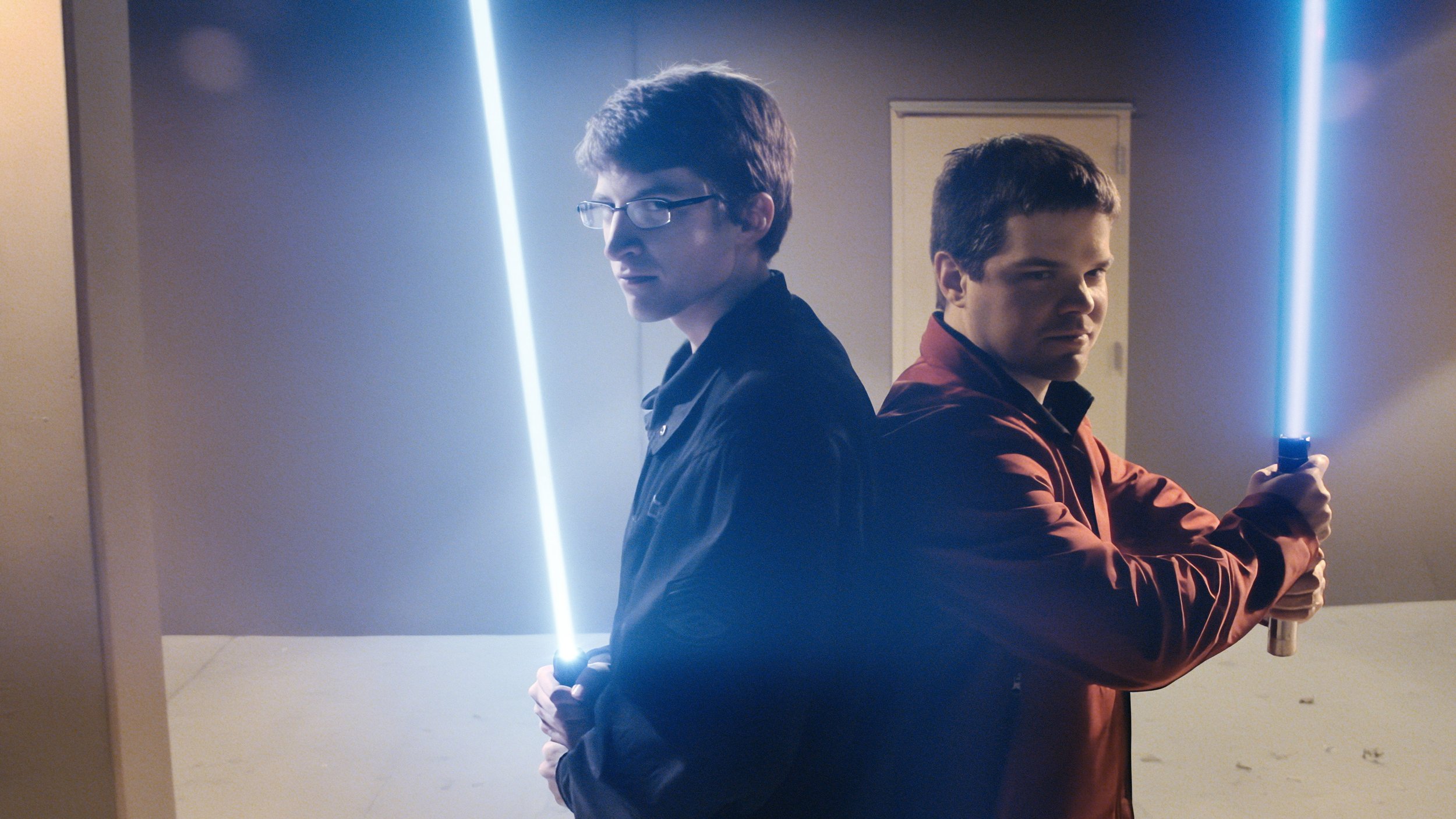
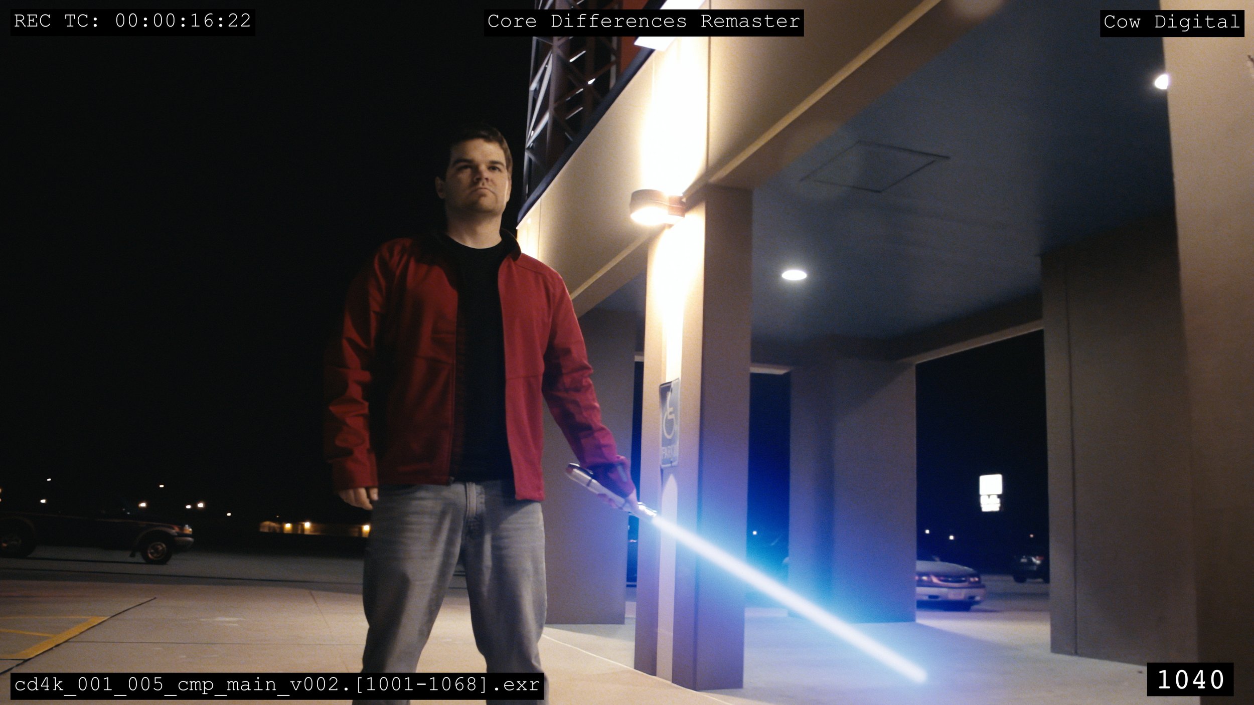
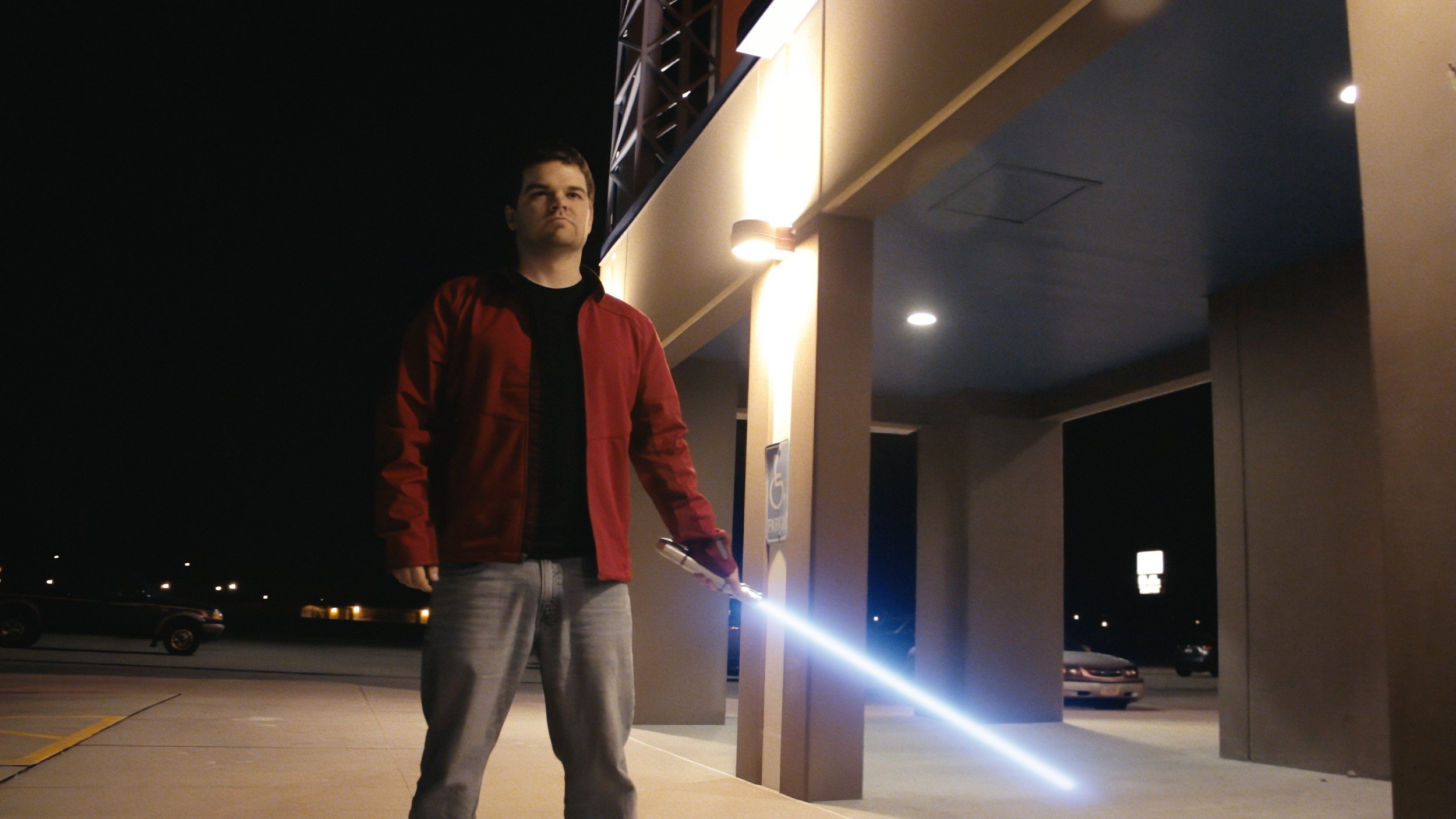
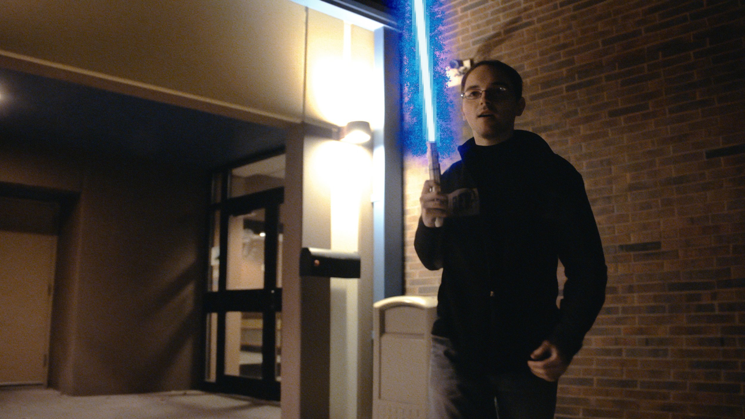
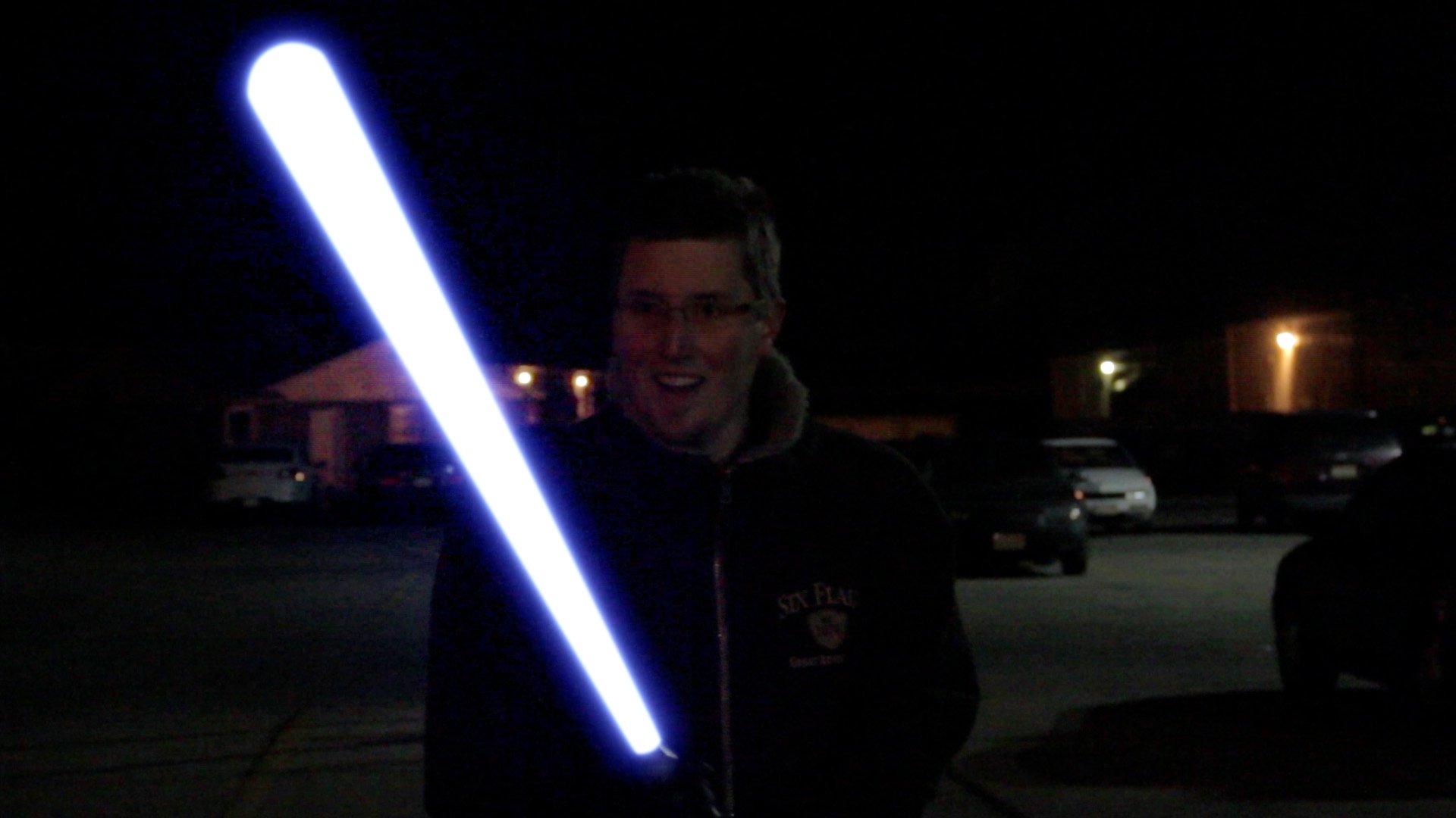
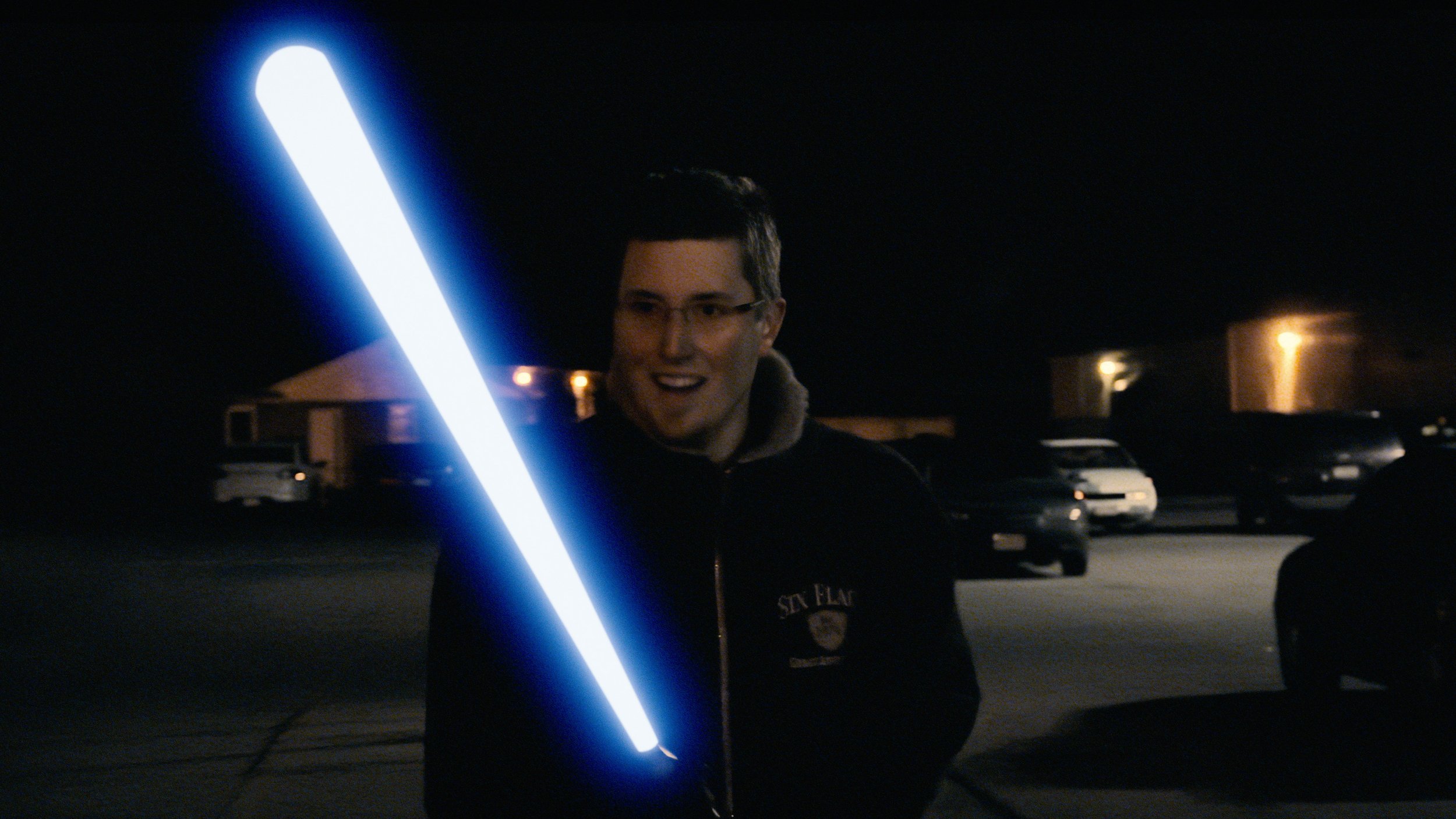
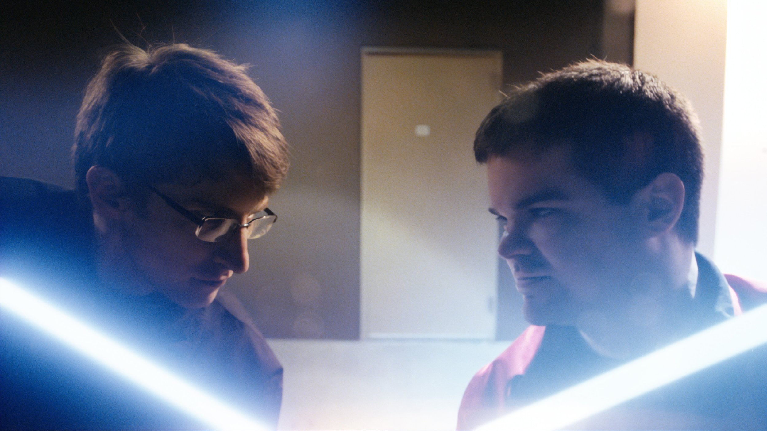
Without spoiling plans I may or may not have for bringing new life to past projects, there was a fantastic opportunity for a soup-to-nuts test on something small. The 10-year anniversary of Core Differences was coming up—a 2-minute sparring session over preferred styles of lightsaber glows between Christopher “VaporTrail” Spenceley and myself. About 4-5 weeks prior to the anniversary, Vapes hit me up with the idea to re-release it as a 4k up-res (the original was shot on my Canon 60D in 1080p). I can’t remember if I had mentioned to him that I was experimenting with this stuff, or if it was totally happenstance. Either way, it seemed a perfect sized project to try out everything I was thinking in terms of workflows, so project code CD4K was born.
We of course missed our target date of releasing precisely on the anniversary, but that was a combination of my schedule being full with a freelance project (a good thing) and what turned out to be a much more involved and intricate process, from figuring out the right AI models to employ on different shots, to the color workflow, to what sort of finishing work I would need to do in Nuke, all of which I’ll outline in upcoming posts and possibly videos (trying not to overpromise on the video front).
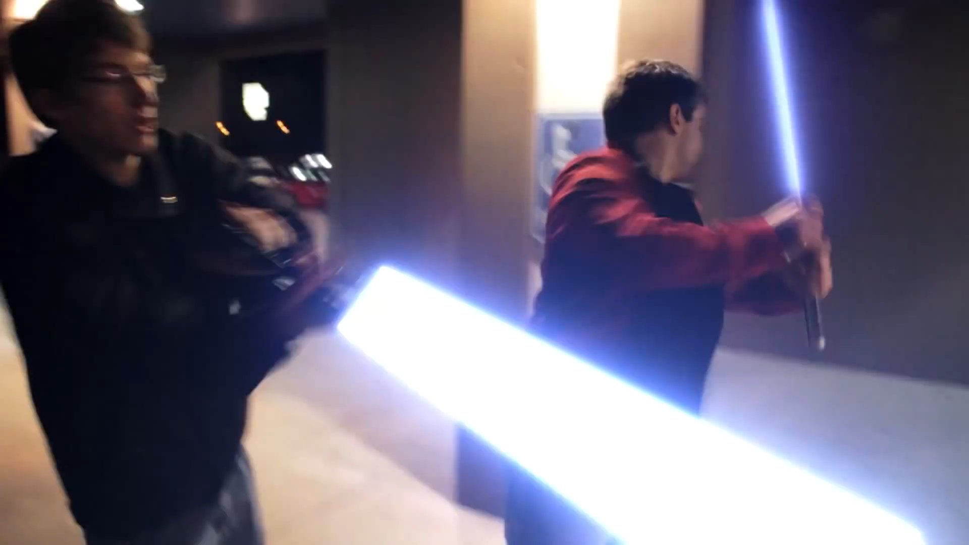
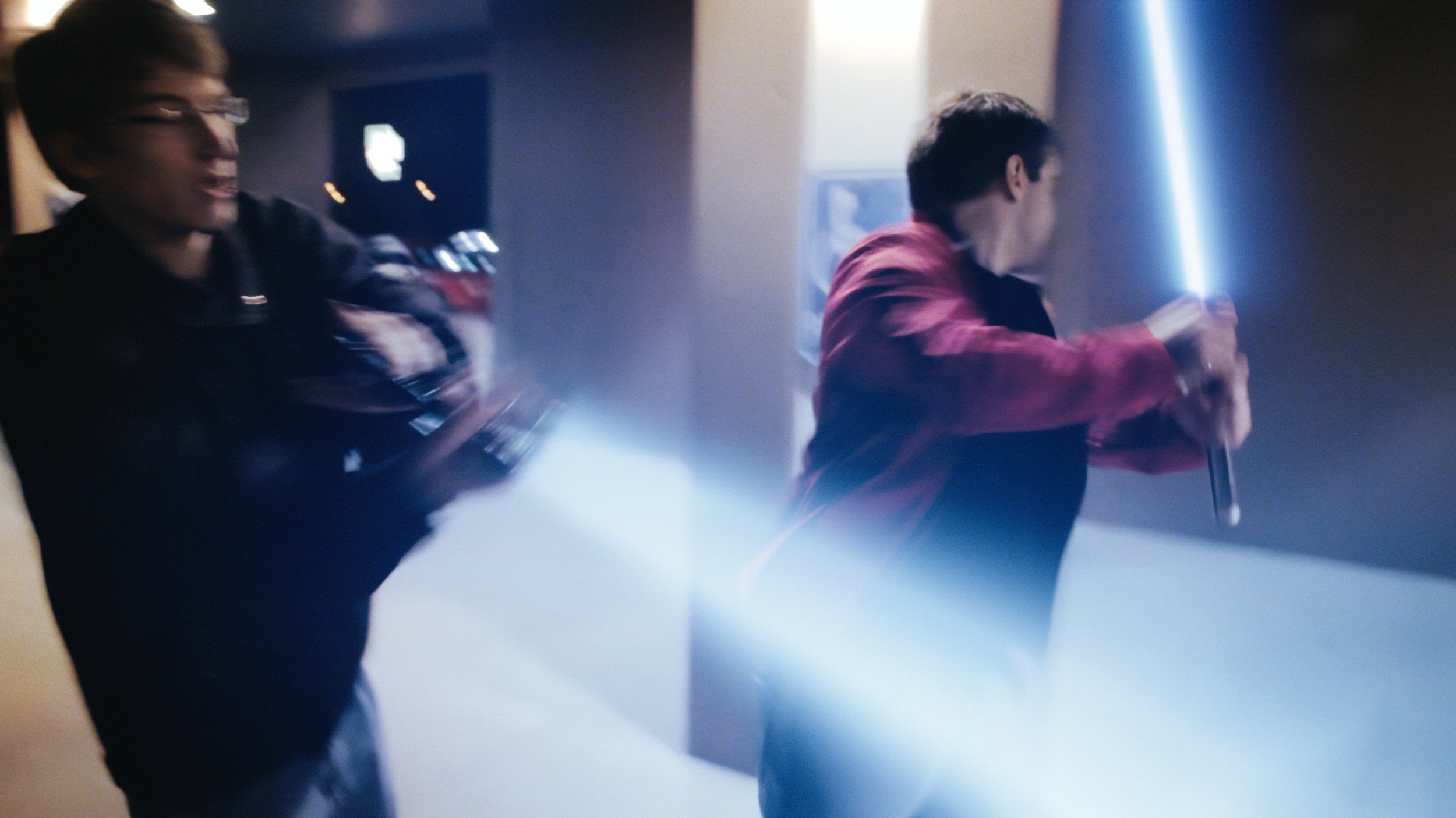
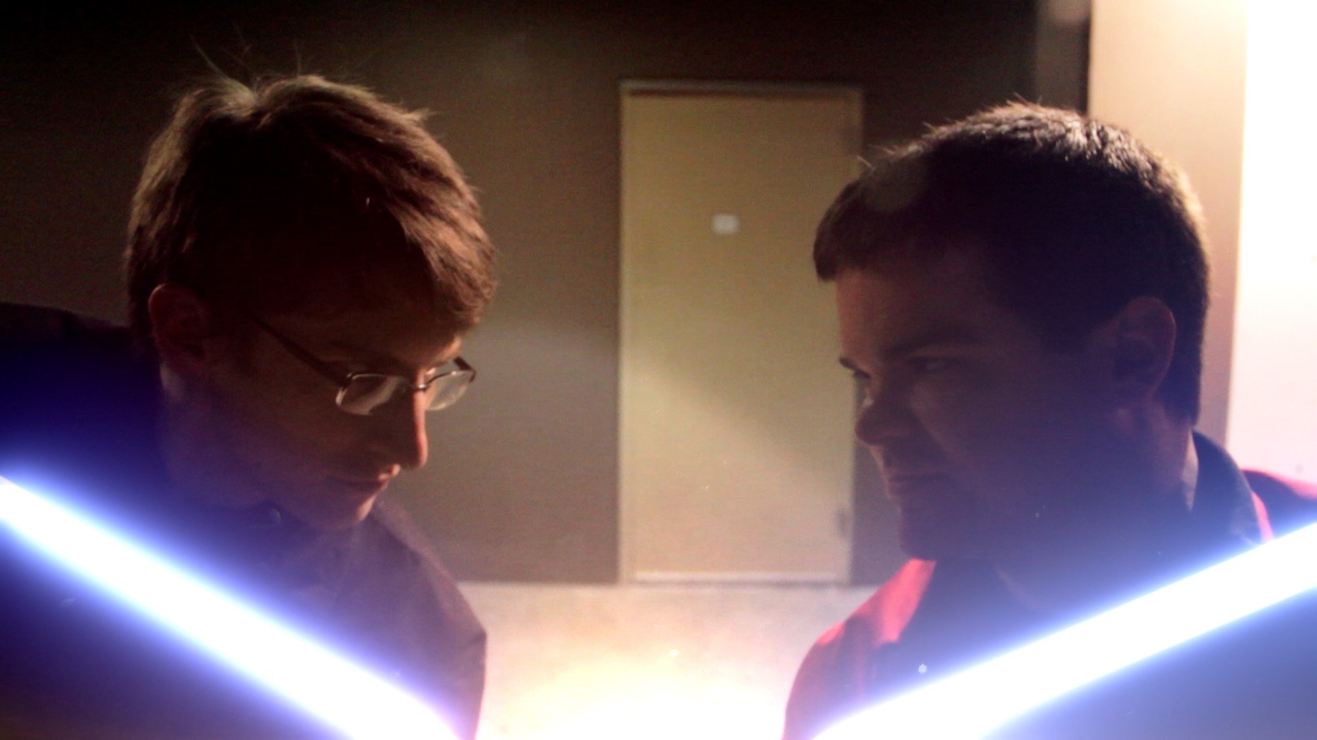
That’s nothing to say about the process of recreating (and updating) the lightsabers, this time in Nuke and in linear space (more on all this later). I’ll gladly risk being accused of George Lucas’ing my own stuff here. But in my opinion, the more refined lightsaber effects in this 4k version stand as much more distinct from one another, both in style and even shade of blue. The new version is less our old fanfilm preferences of yesteryear—a mere “soft” verses “sharp” lightsaber core; hence the title—and more of a celebratory romp between Original Trilogy and Sequel Trilogy—two camps in which we would clearly put ourselves today.
A look at my saber styles over the years:
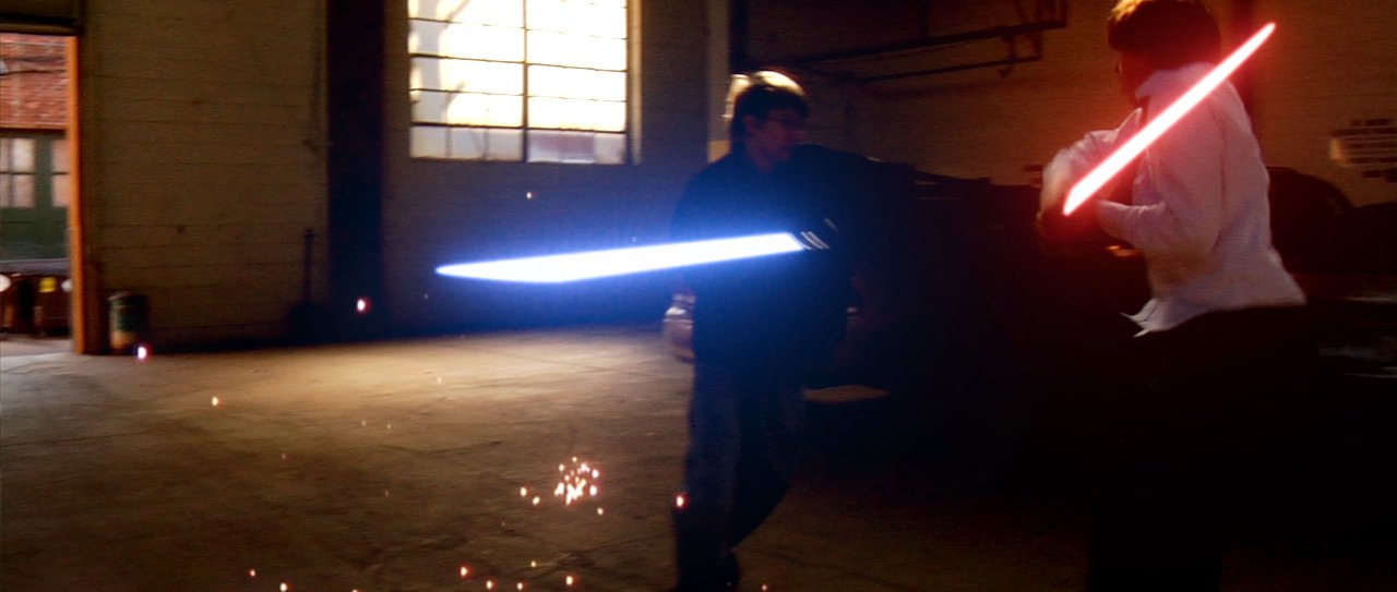
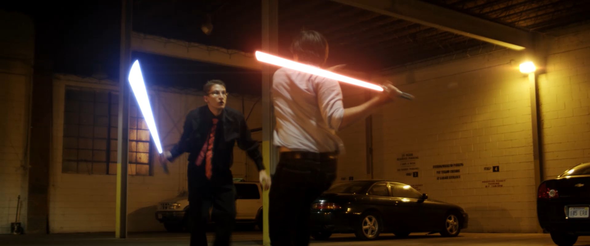
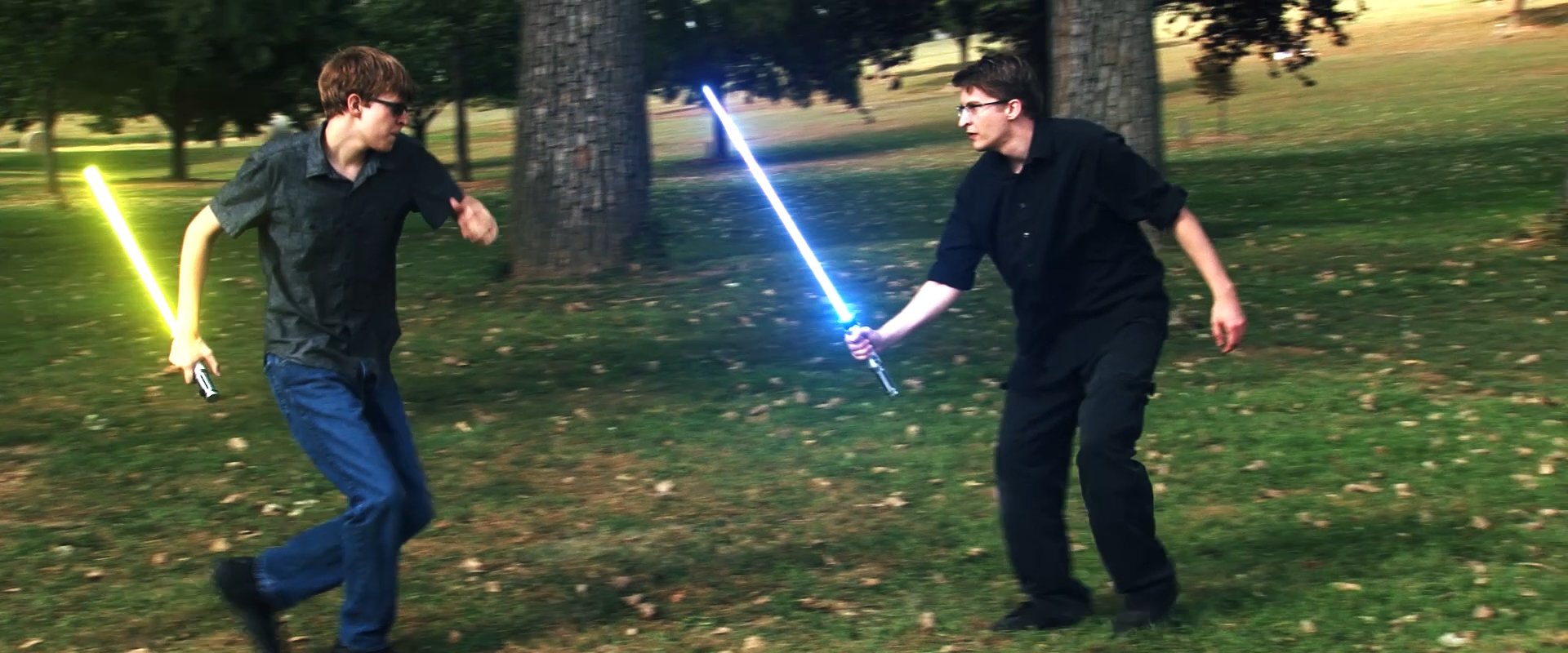
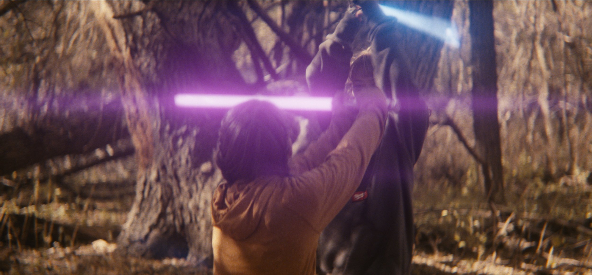
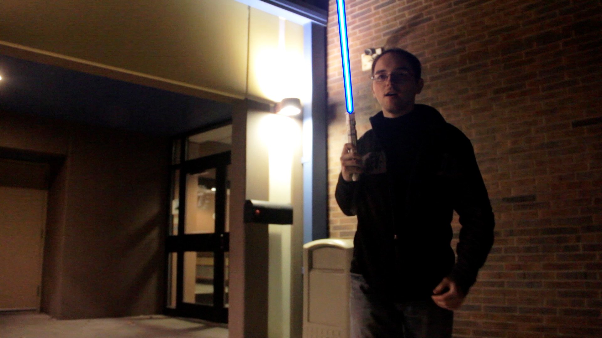
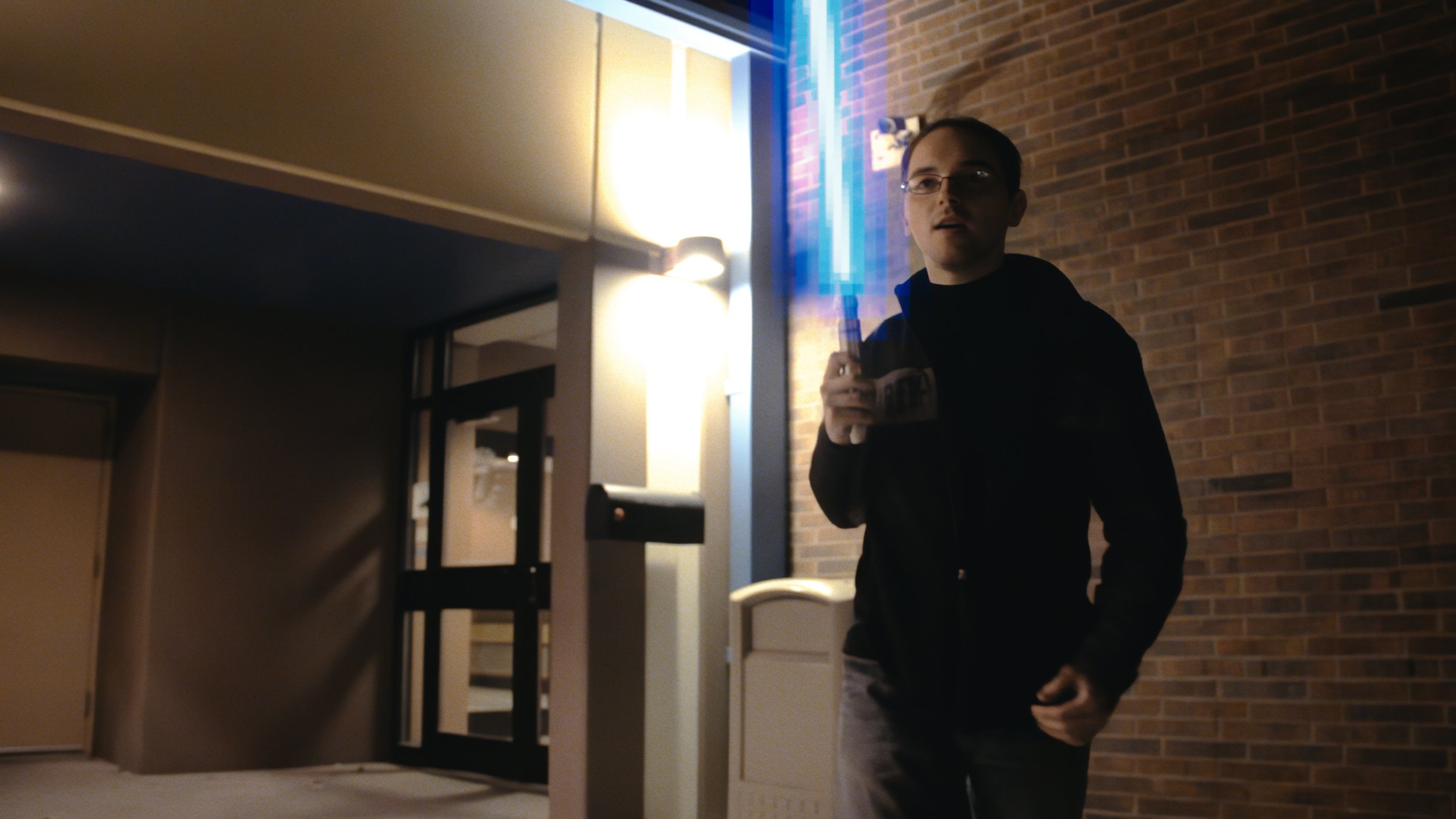
The original Core Differences was created right in the midst of Duel of the Dorks and Alex vs Nate 2 (we actually shot Core Differences in February 2013, 5 months before AvN2), a time in which I rocked a style of lightsaber that sprung from The Phantom Menace and became rather clean, with a broad falloff and saturated colors. But just a couple years later, I would instantly fall in love with the style of sabers in the Sequel Trilogy, to me a celebration of the characteristics of the lenses and how they react to brightly photographed objects… an embracing of imperfections that give the blades so much life. In a way, a hark back to the quirks of hand drawn, optical lightsabers, which so perfectly brings us full circle to Vapes’ preferred look of Empire Strikes Back…
That Old School Look
I spent quite a view versions of a couple of different shots in CD4k trying to nail down the look Vapes preferred as he played the role of a picky client, something I assured him I was used to and had no problem with. Each time I branched out in Nuke to try something new from scratch was an opportunity, like Sam Seaborn trying to nail the perfect birthday message. I ultimately struck upon the solution in the shower, thinking about the old processes used in the 80’s, and what sort of imperfections or “mistakes” could’ve happened, and how to recreate that digitally. It ended up being a bit of a eureka moment, and is well deserving of its own post, I promise.
Even Tim’s “MS Paint” saber got an update, as my girlfriend Hannah weighed in on my pixelated work-in-progress, opining that it should “look like the spray can.” Great Scott! How right you were, my love!
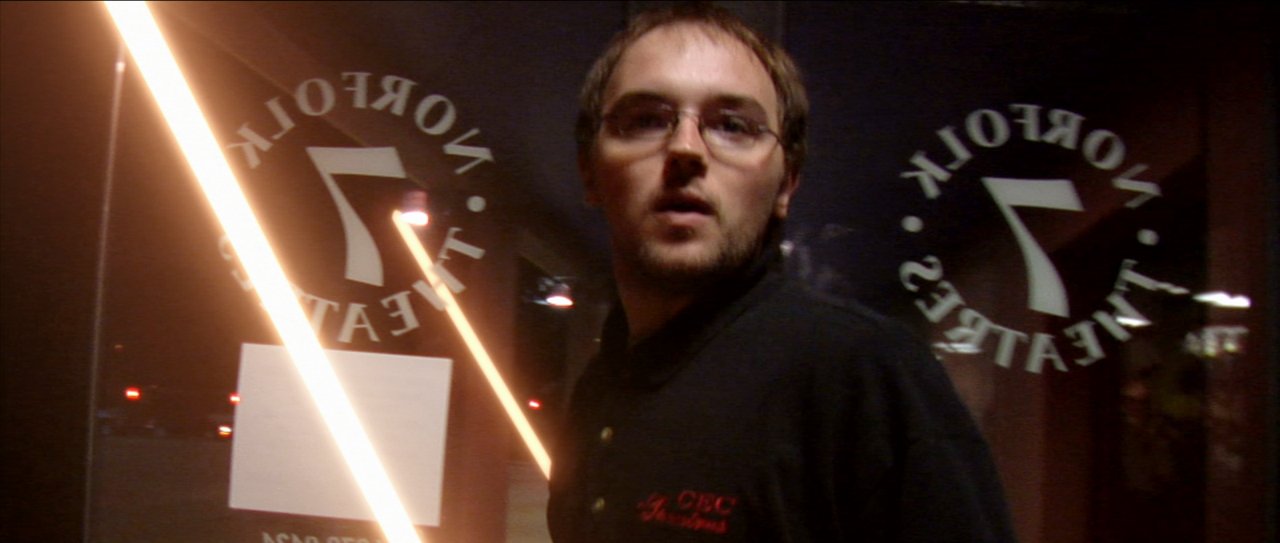
Boter’s entrance remains unchanged, merely recreated in Nuke, with a saber reminiscent of Revenge of the Sith, a look I spent many of my much younger years deriding on the internet, but would now merely state is “not my preference.” The well runs deep with canonized lightsaber effects from which to draw inspiration these days. Take your pick and run wild, I say! And take pride in whatever you create!
What I find most remarkable about this newly remastered version, besides just how ridiculously low quality the original looks by comparison, is the story of how Vapes and my ongoing feud has concluded, with our mutual appreciation of each others’ final lightsaber looks… albeit worth noting he ultimately won. My saber in this is still a little artificially sharper than I personally prefer it now, in order to keep a bit more contrast between them. But Sisters’ Quarrel saw cores soft enough to satisfy all of Vapes’ blurry dreams.
More thoughts to come…